Your Cart is Empty
FREE U.S. DOMESTIC SHIPPING ON ORDERS $199+ • 100% MONEY-BACK GUARANTEE • Lifetime Access • No Subscription
FREE U.S. DOMESTIC SHIPPING ON ORDERS $199+ • 100% MONEY-BACK GUARANTEE • Lifetime Access • No Subscription


$447.97 $377.97
You Save 15% ($70.00) ![]()
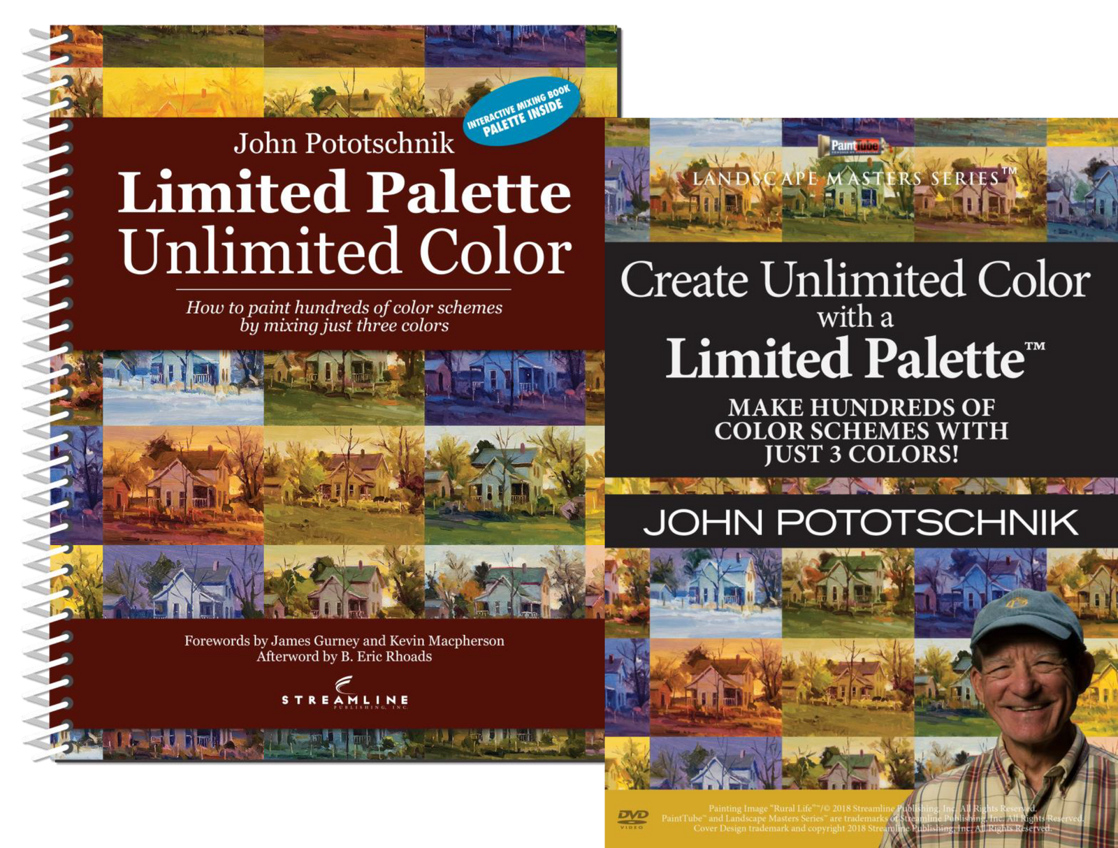
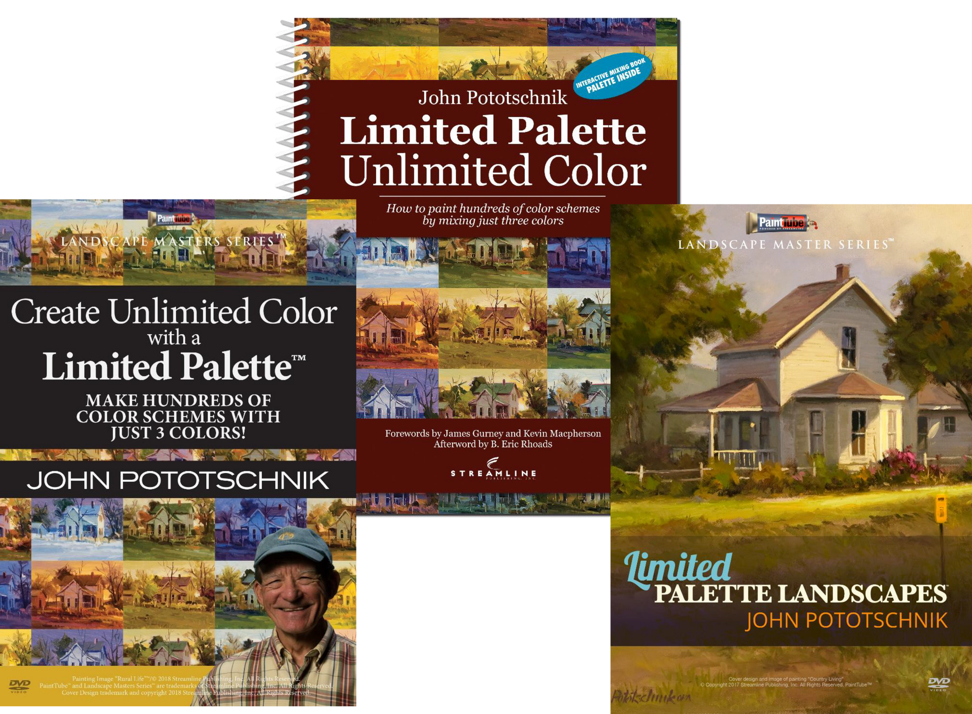
This bundle includes 2 popular videos by John Pototschnik AND his Limited Palette Softcover Book
Combined video length: Over 20 Hours
Limited Palette Landscapes
Video Length: 15 Hours, 15 Minutes
Discover One Of The Most Powerful Techniques For Dramatically Improving Your Painting Skills Right Now
Sometimes the most simple painting techniques can unlock a world of possibility…
If you learn how to mix your colors the right way, you can create incredible “warm” and “cool” tones that tug at your viewer’s heartstrings.
The right color harmony can make a painting vibrate and create a deep emotional connection with your viewer.
In fact, working with and mixing your paint colors is one of the most important skills you need to have as a painter … and yet so many people unknowingly get it wrong.
This is one of the most common reasons painters get frustrated. The painting isn’t coming together, and they cannot figure out why — when all along, it may be lacking color harmony.
If you make the wrong color choices:
…and all of this creates disharmony in your work and makes makes things appear “off” to the viewer.
And if that wasn’t enough, it’s also overwhelming to sit down and look at all those different tubes of paint and ask yourself, “Where do I start?”
After all, you may think that more tubes of color are helping your painting, but it could be that it’s impossible to find harmony with too many colors.
Has this ever happened to you?
If so, the acclaimed landscape painter John Pototschnik has a surprising solution:
Limit your palette!
It may sound simple at first, but this is the key to building a strong foundation for creating impressive paintings — no matter what your style or genre is.
Here’s how it works:
Start out with three primary colors only: alizarin crimson, ultramarine blue, and cadmium yellow pale…
… then you mix your additional colors the correct way by using different combinations of these primary colors.
You see, if you spend just a little time creating a color wheel with different shades mixed from these colors, you can refer to it over and over and always “find your way” to the right color for anything in your work.
All of the shades in your painting will create a sense of harmony because they’re derived from the same primary colors.
So if you take the time to learn the fundamentals of working with a limited palette, you can mix and paint with colors in a much more masterful way.
In fact, it’s no exaggeration to say that this is one of the most exciting discoveries you can make as a painter.
But this is not something you can easily learn from a book.
You really need someone to take you by the hand and show you how it works up close … and for that, there really is no better teacher than John Pototschnik, because:
He’s The Master Artist Who Has Helped Countless Students Take Their Painting Experience To The Next Level
It’s true, and here’s why:
John has been painting professionally since 1982, and over the course of his 35-year career as a fine artist, he’s received an impressive number of regional and national awards, including four George Washington Honor Medals and the John Steven Jones Fellowship.
John’s work can be found in several private and public collections all over the U.S., and he’s been featured in seven different art books and a wide variety of prestigious art magazines, including: The Artist’s Magazine, Southwest Art, American Artist, PleinAir, American Art Collector, and more.
His influences include many of the French masters from the Barbizon School, including:
John is well known for his beautiful naturalist style, often depicting pastoral settings of subjects ranging from stoic farm scenes in the Southwest United States to regal villas in the Italian countryside.
John is a true master when it comes to working with value to establish mood and draw the viewer in — in fact, this is one of the key details that sets his work apart from that of other landscape painters.
You’ll also discover:
Unlimited Color With A Limited Palette
Video Length: 5 hours, 12 Minutes
Answer your color questions with this new video from master artist John Pototschnik. Through multiple paint-mixing exercises and landscape painting studies, John demonstrates the benefits of using a simple three-primary palette.
You’ll discover the joy of painting once again as you learn to select the best color scheme — whatever mood you’re looking to create, there’s a color scheme that will work to convey that to your viewer. You’ll achieve color harmony for more successful paintings every time! You’ll learn how to mix pure, clean color, and when it’s OK to use “mud.” And you’ll learn how to modify and expand your color choices for nearly endless painting possibilities. This video is packed with helpful information that will encourage and inspire you to enjoy color as you never have before.
IN THIS PAINTING VIDEO YOU WILL LEARN:
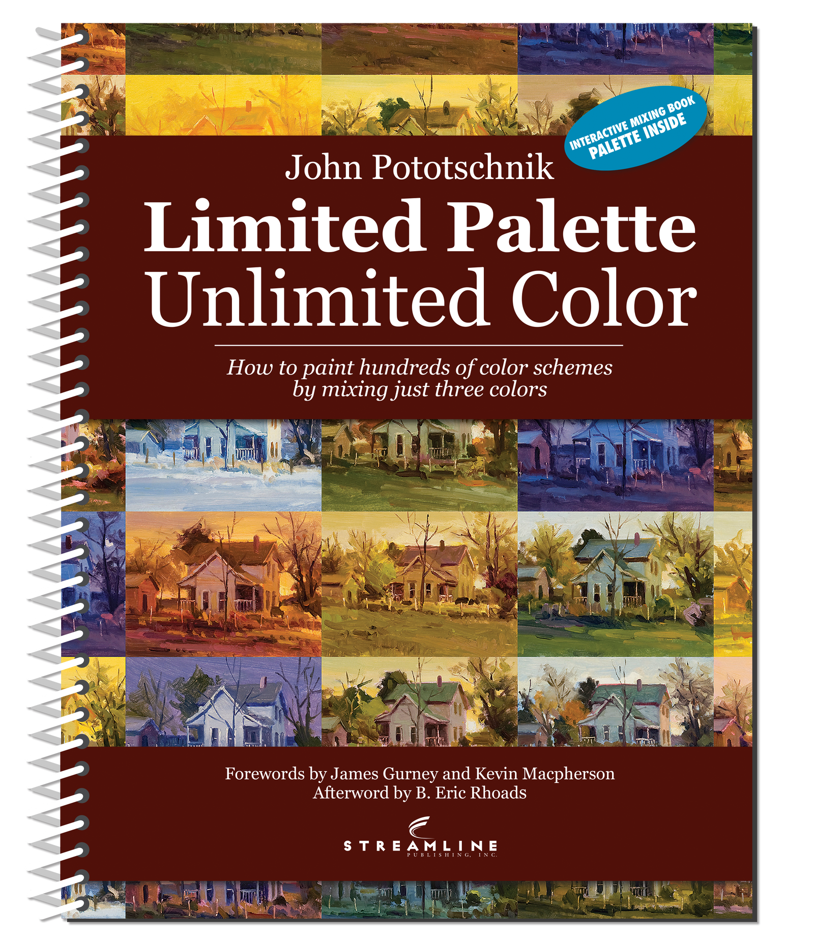
Unlimited Color With A Limited Palette Softcover Book
The heart of this book features 46 paintings divided into seven major divisions of the color wheel: Complements, Equilateral Triads, Isosceles Triads, Square Quadratics, Rectangular Quadratics, Extended Analogous, and Primary Dominant. Each painting was created using the same three primary colors, plus white. In addition, the subject, composition, and basic value structure of the paintings are the same, the only thing that changes is the color scheme. This is what makes this workbook special and unique. The book comes with a clear palette so you can mix colors right over those shown in the book. This is like a gourmet cookbook for paint artists who wish to expand their world of color.
The 96-page spiral bound workbook is just that, it is a workbook designed to be used in the studio, not to be read once and put on a shelf. It teaches not only the benefits of using a simple three-primary color palette, but also:
Practice color mixing on a piece of clear acetate laid directly on a selected image. Acetate is included with the book.
Included with each book are Projects specifically designed to reinforce what is taught. It will be a powerful learning experience.
Click here to view the John Pototschnik book clip from PACE 2019
*Order extra acrylic sheet here: https://lilipubsorders.com/products/limited-palette-unlimited-color-acrylic-sheet